

On-screen User Interface
This section explains various user interface components shown in the touch screens, and how to use them.
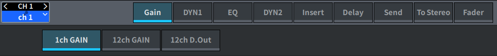
Tabs
Tabs are used when switching between multiple pages. The page name is displayed on the tab.
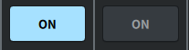
Buttons
Buttons are used to execute specific functions, to switch parameters on/off, or to select one of multiple choices. Buttons that perform on/off operations appear in solid colors while they are turned on, and are dark when turned off.
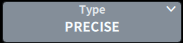
When you press the  button, a separate popup window will open, allowing you to make detailed settings.

When you press the  button, a pull-down menu will appear.
When you press the expand  button or collapse
  button, windows such as the EQ or dynamic will expand or collapse.
List screens
Windows similar to the following are displayed to allow you to select items from a list, such as the USER DEFINED knob setting window.
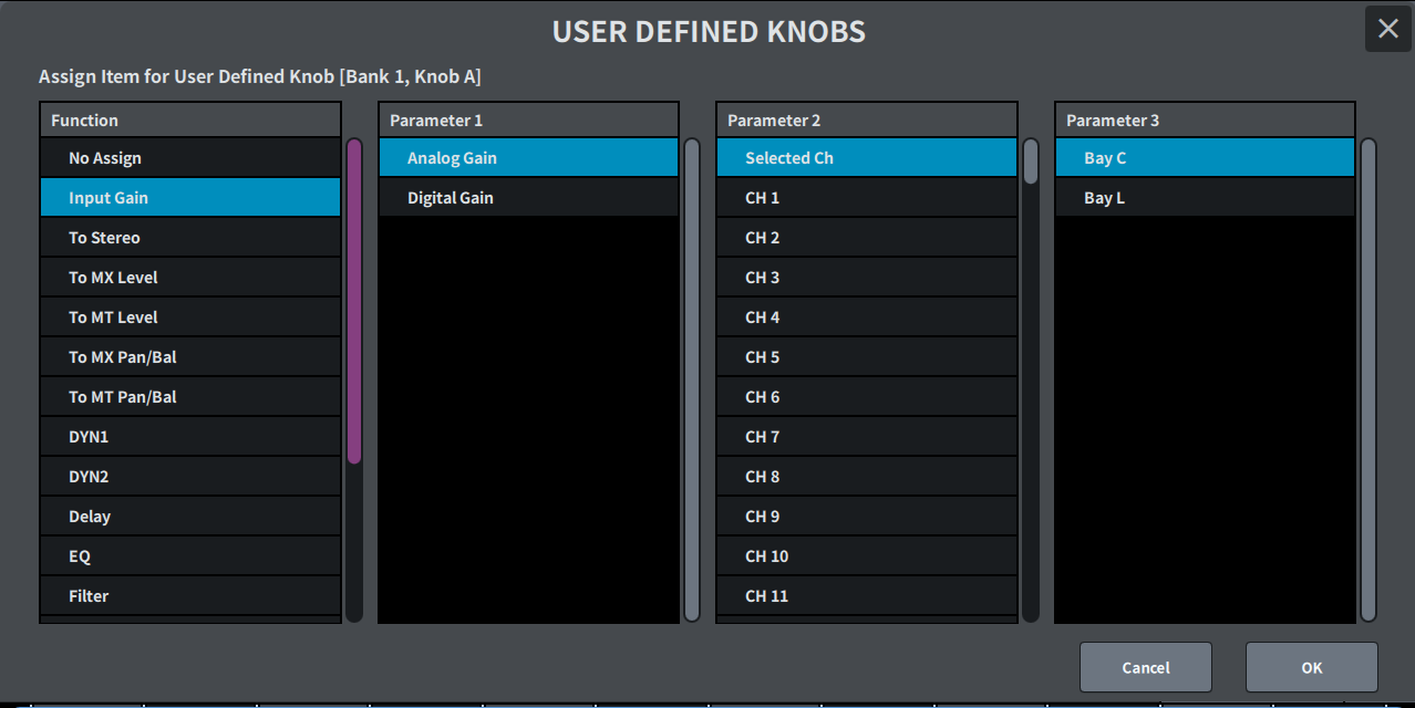
The blue item in the list is the item that is selected for operation. Use the [TOUCH AND TURN] knob to scroll up and down the list.
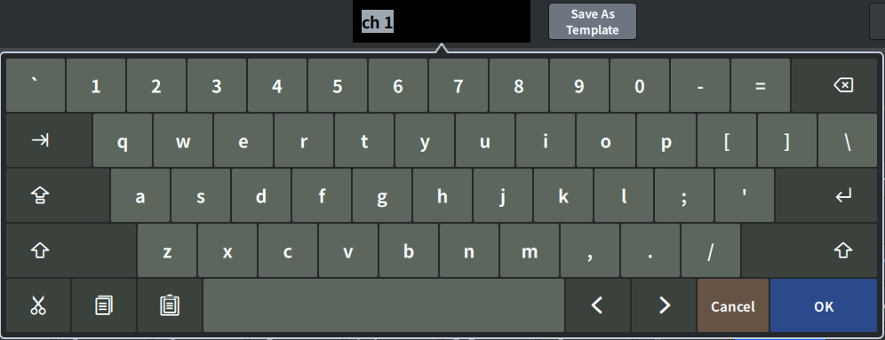
Keyboard screen
The following keyboard window will appear when you need to assign a name or comment to a scene or library, or when you need to assign a channel name. Press the character buttons on the screen to enter the desired characters.
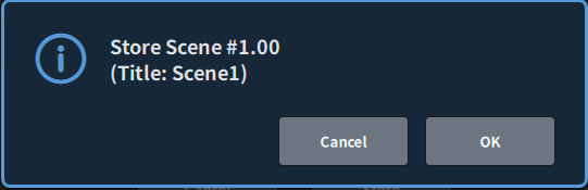
Dialog boxes
Dialog boxes similar to the following allow you to confirm operations you just performed. Press the OK button to execute the operation. The operation will be canceled if you press the CANCEL button.
 DM7 Series