“Controllers” area
11. “Controllers” area
This area shows a list of the project’s controllers and pages. The selected page is shown in the work area.
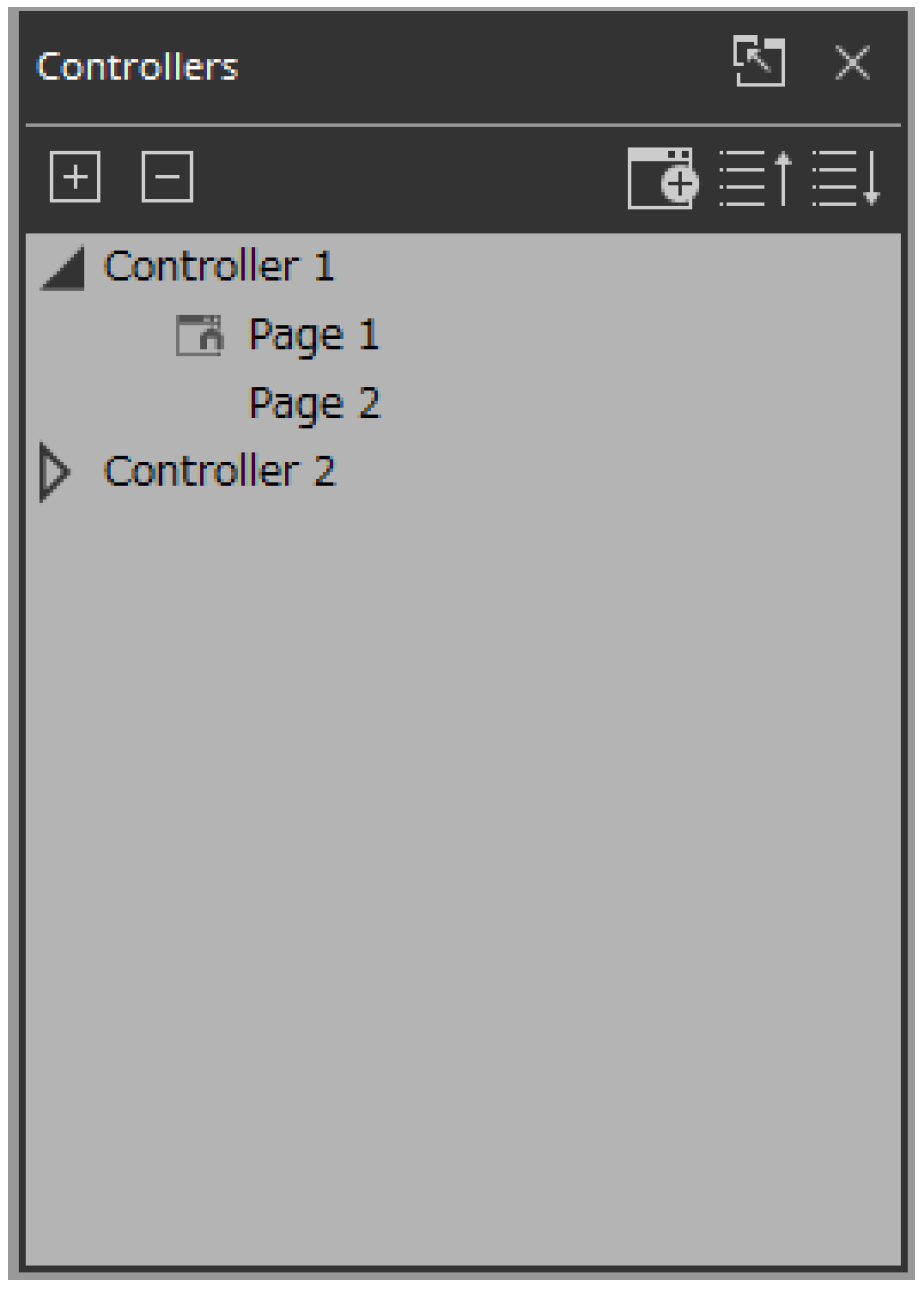
By clicking the triangle
 located at the left of a controller, you can expand or collapse the pages for each individual controller.
There are two types of icons on the left side of the page.
 Home Page: This is the page to be displayed when a controller file is launched in Kiosk.
 Fallback: This is the page to be displayed if a problem occurs with Kiosk.
 Home & Fallback: This is a page that serves both functions.
■ Buttons
Here we explain the buttons of the “Controllers” area.
| Button | Command | Summary |
|---|---|---|
|
|
[Expand All] |
Expands all controllers and pages. |
|
|
[Collapse All] |
Collapses all controllers and pages. |
|
|
[Add] |
Adds a controller. One page is added to the controller that is added. |
|
|
[Move Page Up] |
Move the selected page one position upward. |
|
|
[Move Page Down] |
Move the selected page one position downward. |
■ Context menu
| Menu | Summary |
|---|---|
|
[Add Page] |
Adds a page to the selected controller. If a page is selected, the page is added to the controller that includes that page. |
|
[Duplicate] |
Adds a duplicate of the selected controller or page. If a page is selected, the duplicate is added to the controller that includes that page. |
|
[Delete] |
Deletes the selected controller or page. |
|
[Rename] |
Lets you rename the selected controller or page. |
|
[Run] |
Runs the selected controller in control mode.
|
|
[Run Controller File] |
Opens the “Run Controller File” dialog box.
|
|
[Export] |
Creates a controller file for the selected controller. |
|
[Set as HOME] |
Sets the selected page as the home page of that controller. |
|
[Set as Fallback] |
Specifies the page to be displayed if a problem occurs with Kiosk (such as a code authentication failure). |
■Properties
Here we explain the parameters that are shown in the “Properties” area when the focus is on a controller or page. Depending on the type of controller, some parameters are not shown.
●Controller
| Property | Value |
|---|---|
|
General |
|
|
[Name] |
The name of the controller. Click this to edit it. |
|
[Comment] |
A comment for the controller. You can use this to enter explanatory content that is not sufficiently conveyed by the controller name. |
|
[Enable File Operation for Power User] |
In Kiosk, this opens a controller file with Power User privileges.
|
|
[Auto Page Change] |
This property switches the Kiosk page when a preset or scene is recalled from a specified device. |
| Property | Value |
|---|---|
|
Pages |
|
|
[Display Aspect Ratio] |
Screen ratio (horizontal:vertical)
|
|
[Horizontal] |
Specifies the horizontal size of the controller when Display Aspect Ratio is set to Custom.
|
|
[Vertical] |
Specifies the vertical size of the controller when Display Aspect Ratio is set to Custom.
|
|
[Display Size] |
The diagonal length of the controller.
|
|
[90-degree rotation] |
Select (Yes) to swap the vertical and horizontal dimensions of the controller.
|
|
[Open with Full Screen Style] |
Select (Yes) to display the Kiosk in full screen. |
|
Pass code |
|
|
[Pass Code Setting] |
Select the code set in the “Setup” dialog box (Use Project Pass Code) or the code set for each controller (Use Controller Pass Code) as the passcode to be used in Kiosk.
|
|
[Administrator Code] |
These codes become editable when [Use Controller Pass Code] is selected in [Pass Code Setting].
|
|
[Power User Code] |
|
|
[Unlock Code] |
|
|
ProVisionaire Edge |
|
|
[ProVisionaire Edge Setting] |
For each controller, this selects whether settings for ProVisionaire Edge will use the settings specified in the “Setup” dialog box (Use Project Setting) or the settings specified in the controller’s properties (Use Controller Setting).
|
|
[Destination ProVisionaire Edge] |
This property becomes editable when [Use Controller Setting] is selected in [ProVisionaire Edge Setting].
|
|
[Destination ProVisionaire Edge IP Address] |
This property becomes editable when [Use Controller Setting] is selected in [ProVisionaire Edge Setting] and Other PC is selected in [Destination ProVisionaire Edge]. Set the IP address of the computer on which ProVisionaire Edge is installed. |
| Property | Value |
|---|---|
|
Widgets (displayed when used with ProVisionaire Kiosk) |
|
|
[Show Widget Selection Border] |
Select Yes to display a frame around the widget to indicate that it is selected. |
|
[Offline Indication] |
Select Yes to display an indicator in the top right corner of the widget, showing the online status of the device that has the parameters. |
|
[No Assign Indication] |
Select Yes to display a clip in the top right corner of widgets to which no device parameters are assigned. |
| Property | Value |
|---|---|
|
Controller |
|
|
These are the same setting as Properties > pages under Controller. |
|
|
Page |
|
|
[Name] |
The name of the page. Click this to edit it. |
|
[Comment] |
A comment for the page. When you click this, the “Edit Text” dialog box opens, allowing you to edit the comment. |
|
[HOME Page] |
Yes is displayed when the page is set as the home page.
|
|
[Fallback Page] |
Yes is displayed when the page is set as the fallback page.
|
|
[Power User Code Required] |
Select Yes to authenticate with a Power User code when navigating to this page in Kiosk.
|
|
[Background Color] |
The background color of the page. When you click the square, the “Select Color” dialog box opens, allowing you to select a background color. |
|
[Background Image] |
The background image of the page. When you click the square, the “Select Image” dialog box opens, allowing you to select image data that will be shown above the background color. If you click the trash can button, the background image settings are discarded. |
|
[Scaling] |
Sets the reduction ratio of the image. |
|
[Image Expansion Mode] |
Specifies how the background image is shown. For details on this setting, refer to 「About the Expansion Mode」 |
|
[Snap to Grid] |
Selects whether widgets will be aligned with the grid (Yes) or can be placed freely (No). |
|
[Dot Color] |
The color of the grid’s dots. When you click the square, the “Select Color” dialog box opens, allowing you to select the dot color. |
|
[Cell Width] |
The spacing of the grid. When you click this, a spin box appears; you can edit the setting by clicking or by directly entering a value. |