Widgets
16. Widgets
This chapter describes widgets and parameters that are displayed in the “Properties” area when a widget is selected.
16.1. “Common widget items”
16.1.1. General
| Property | Value |
|---|---|
|
[Name] |
The name of the widget. If you place the widget first and assign a parameter later, you can enter a name here to indicate the parameter that you intend to assign. |
|
[Type] |
The type of widget. |
|
[Visible] |
When [No] is selected, the widget will not be displayed when Kiosk starts up. |
|
[Read Only] |
When [Yes] is selected, you will not be able to operate the widget when Kiosk starts up. In this case, the widget acts like an indicator. |
16.1.2. Control
| Property | Value |
|---|---|
|
[Model] |
The model name of the device that has parameters, presets, etc., assigned to the widget. |
|
[Device Identifier] |
The search method for devices on the network.
|
|
[Parameter Address] |
The address of the parameter assigned to the widget. |
|
[Input Channel] |
The channel number of the parameter assigned to the widget. |
|
[Confirmation] |
When [Yes] is selected, a confirmation message appears before Kiosk executes the operation. |
|
[Confirmation Text] |
Click here to edit the confirmation message. |
16.1.3. Position/Appearance
All information other than the X and Y values is style-related information.
| Property | Value |
|---|---|
|
[X] |
Specifies the horizontal distance from the top left of the screen and the top left of the widget. |
|
[Y] |
Specifies the vertical distance from the top left of the screen and the top left of the widget. |
|
[Width] |
Specifies the width of the widget. |
|
[Height] |
Specifies the height of the widget. |
|
[Lock Aspect Ratio] |
Selects whether the width/height ratio of the widget will be fixed. |
|
[Shape] |
Selects the widget shape. |
|
[Corner] |
Sets the corner radius of the widget. |
|
[Border Style] |
Selects the type of border for the widget. |
|
[Border Color] |
Specifies the color of the slit’s border. |
|
[Border Width] |
Specifies the width of the slit’s border. |
|
[Gradient] |
Selects the type of gradation within the slit. |
|
[Color]
|
Specifies the color within the widget. |
|
[Background Color]
|
Specify the background color within the widget. |
|
[Image]
|
Specifies the image within the widget. |
|
[Image Expansion Mode]
|
Selects how the image is seen within the widget. |
|
[Scaling]
|
Sets the reduction ratio of the image. |
|
[Effect] |
Specifies how a shadow is added to the outer part of the widget. |
*1 If the widget has statuses, each status can be set.
Image Expansion Mode
• None
The image is placed in the center of the area without any change in size
• Full
The displayed image is scaled to fit the entire display area in both height and width, while its aspect ratio is ignored.
• Aspect Fill
The displayed image is scaled to fill as much of the display area as possible, while its aspect ratio is maintained.
• Aspect Fit
The displayed image is scaled to the maximum size that fits the entire image in the display area, while its aspect ratio is maintained.
• Scaling
You can set the image reduction ratio in relation to the widget. When 100% is selected, the displayed image will fill the entire area.
16.1.4. Text
A text string to be displayed inside the widget.
Information other than “Text” is style-related information.
| Property | Value |
|---|---|
|
[Visible]
|
Select [Yes] to display the text in Kiosk. |
|
[Text]
|
Specifies the text. |
|
[Font] |
Specifies the font of the text. |
|
[Color]
|
Specifies the color of the text. |
|
[Vertical Alignment] |
Selects the vertical position of the text. |
|
[Horizontal Alignment] |
Selects the horizontal position of the text. |
|
[Direction] |
Selects the direction of the text. |
*1 If the widget has statuses, each status can be set.
16.1.5. Label / Value Lavel
A text string to be displayed outside the widget.
Information other than “Text” is style-related information.
| Property | Value |
|---|---|
|
[Visible] |
Select [Yes] to display the label in Kiosk. |
|
[Text] |
Edits the label. |
|
[Font] |
Specifies the font of the label. |
|
[Font Color] |
Specifies the color of the label. |
|
[Position] |
Selects the position of the label. |
|
[Alignment] |
Selects the alignment of the label. |
|
[Margin] |
Sets the distance between the label and the widget. |
16.2. Recall Button
Used to recall scenes or presets.
You can assign up to 16 presets or scenes for the same device or multiple devices.
Control
| Property | Value |
|---|---|
|
[Control] |
Click the [...] button to open the “Target Editor” dialog box.
|
|
[Indicator Mode] |
When Press is selected, the [On Color] color will always be applied.
|
|
[Preset No]
|
These select the number of the scene, preset,or snapshot. |
For DME/MRX7-D snapshots, drag and drop Snapshot from the “Parameter Sets” area that can be accessed from ProVisionaire Design > DME.
16.3. Page Control Button
Used to navigate to another page in Kiosk.
Control
| Property | Value |
|---|---|
|
[Page Control Action] |
Page Jump
- Moves to the page specified in [Page Name].
|
|
[Page Name] |
This is enabled when Page Jump is selected in [Page Control Action].
|
16.4. Direct Set Button
Changes the device parameter to the value specified in [Press Value].
You can assign up to 16 parameters for the same device or multiple devices.
Control
| Property | Value |
|---|---|
|
[Control] |
Click the [...] button to open the “Target Editor” dialog box.
|
|
[Press Value] |
Sets the value to be set on the device.
|
|
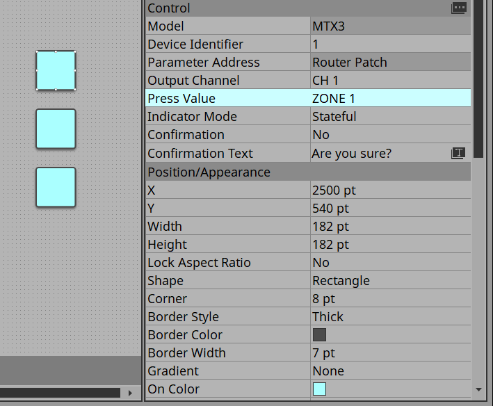
[Indicator Mode] |
When Stateful is selected, the indicator lights up when the device is at the specified value. |
When you click the Direct Set Button, the parameter value set in Press Value under Properties is sent to the device.
If the sent parameter value matches the value of the controlled device, the button lights up in the color specified by On Color. If the values do not match, the button lights up in the color set by Off Color.
By placing multiple Direct Set Buttons, you can achieve radio button-like behavior.
Specifically, these buttons are suitable for controlling the Router and Source Selector parameters of MTX3, MTX5-D, MRX7-D, and DME.
The following shows a specific example.
Place a Direct Set Button and set Indicator Mode in Properties to Stateful.
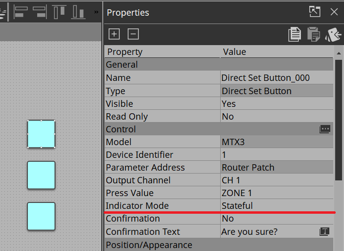
Place multiple buttons with these same settings.
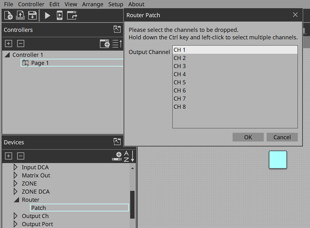
Assign Ch 1 to all buttons from Router > Patch.
Under Properties > Press Value, select Zone 1. For the other buttons, select Zone 2 and Zone 3 respectively.
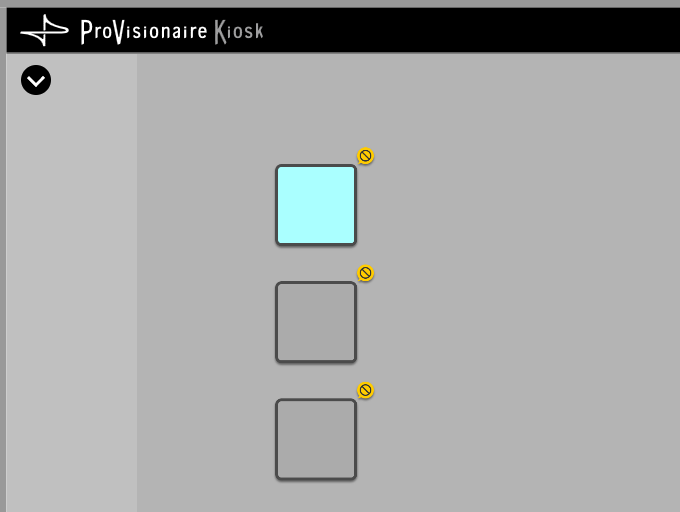
When you execute the buttons on Kiosk and click them, only the button that is on will light up.
16.5. On/Off Button
Toggles device parameter values between on and off.
You can assign up to 16 parameters for the same device or multiple devices.
A button to which multiple parameters are assigned is called a multi button.
When you drag and drop a parameter to a button for which a parameter has already been assigned, a confirmation dialog box asks whether you want to replace (Replace), add (Add), or cancel (Cancel).
Simultaneously select multiple buttons to which parameters have already been assigned and then select Create Multi Button from the Edit menu to create a new multi button.
Control
| Property | Value |
|---|---|
|
[Control] |
Click the [...] button to open the “Target Editor” dialog box.
|
|
[On Value]
|
Sets the value that will be set on the device when the button is turned on or off.
|
|
[Switching Mode] |
Selects whether the button operates in latched or unlatched mode. |
16.6. Inc/Dec Button
Increases or decreases a parameter value of the device.
Control
| Property | Value |
|---|---|
|
[Inc/Dec Step] |
Sets the amount by which to increase or decrease the value each time you click.
|
|
[Repeat] |
When [Yes] is selected, you can press and hold the button to continuously increase/decrease. |
|
[Rotation] |
When [Yes] is selected, click the button when the value reaches the maximum value to change the value to the minimum value.
|
|
[Upper Bound Value] |
Specifies the maximum value. |
|
[Lower Bound Value] |
Specifies the minimum value. |
16.7. Direct Play Button
Plays back/stops files on the SD card or USB flash drive inserted in the MTX/MRX7-D.
Control
| Property | Value |
|---|---|
|
[Action] |
Play
- Plays the file.
|
|
[Play Target] |
Play 1 Song
- Plays the file specified by [SD Card:/].
|
|
[Play Mode] |
Specifies how the file will be played back.
|
|
[Go to the top when playback stops] |
Specifies the action to be taken when playback starts after stopping.
|
|
[Interval Time] |
Sets the interval between files during playback. |
|
[SD CARD:/] |
Specifies a file or folder on the SD card of MTX, MRX7-D, or DME10/7, or on the USB flash drive of DME5/3. |
16.8. Play Info
This item displays information about the currently selected file on the SD card or USB flash drive inserted in MTX/MRX7-D/DME.
For Properties, refer to
“Common widget items.”
16.9. Transport
This item controls the currently selected file on the SD card or USB flash drive inserted in MTX/MRX7-D/DME.
For Properties, refer to
“Common widget items.”
16.10. Track List
This item selects a file/folder on the SD card or USB flash drive inserted in MTX/MRX7-D/DME.
For Properties, refer to
“Common widget items.”
16.11. Slider
This item mainly changes level-related parameters.
You can assign up to 16 parameters for the same device or multiple devices.
A slider to which multiple parameters are assigned is called a “multi slider.”
When you drag and drop a parameter to a slider for which a parameter has already been assigned, a confirmation dialog box is displayed, asking whether you want to replace or add the parameter, or cancel.
Simultaneously select multiple sliders to which parameters have already been assigned and then select Create Multi Slider from the Edit menu to create a new multi slider.
Control
| Property | Value |
|---|---|
|
[Control] |
Click the [...] button to open the “Target Editor” dialog box.
|
|
[Upper Bound Value] |
Specifies the maximum value. |
|
[Lower Bound Value] |
Specifies the minimum value. |
Appearance/Position
Information about styles.
| Property | Value |
|---|---|
|
[Direction] |
Selects the direction of the widget. |
|
[Rounded Corners] |
Select [Yes] to round the corners of slits. |
|
[Knob Style] |
Selects the type of knob. |
|
[Knob Width] |
Specifies the width of the knob. |
|
[Knob Image] |
Specifies the image of the knob. |
Scale
Information about styles.
| Property | Value |
|---|---|
|
[Position] |
Selects the position of the scale. |
|
[Width] |
Specifies the thickness of the scale. |
|
[Color] |
Specifies the color of the scale. |
|
[Value Visible] |
Select [Yes] to display numbers on the scale. |
|
[Font] |
Selects the font of the scale numerals. |
|
[Font Color] |
Selects the color of the scale numerals. |
16.12. Dial
This item mainly changes level-related parameters.
Control
| Property | Value |
|---|---|
|
[Band Base Value] |
Specifies the initial value specified when the widget is placed. |
Appearance/Position
Information about styles.
| Property | Value |
|---|---|
|
[Dial Type] |
Selects the type of dial. |
|
[Start Angle] |
Sets the knob position when it is at the minimum value. |
|
[End Angle] |
Sets the knob position when it is at the maximum value. |
|
[Knob Color] |
Specifies the color within the knob. |
|
[Background Color] |
Sets the background color within the knob. |
|
[Grip Shape] |
Selects the shape of the grip. |
|
[Grip Size] |
Specifies the size of the grip. |
|
[Grip Color] |
Specifies the color of the grip. |
|
[Band On Color] |
Specifies the color inside the band below the current value. |
|
[Band Off Color] |
Specifies the color inside the band above the current value. |
16.13. Value
This widget displays the current value of a parameter.
For Properties, refer to
“Common widget items.”
16.14. Line Edit
This widget allows you to directly enter parameter values.
For Properties, refer to
“Common widget items.”
16.15. Meter
This item displays the meter value of a device.
Control
| Property | Value |
|---|---|
|
[Meter Type] |
Selects the meter’s display method. |
|
[Bar Base Point] |
Selects the point from which the bar is solidly colored. |
Scale
Information about styles.
| Property | Value |
|---|---|
|
[Position] |
Selects the position of the scale. |
|
[Width] |
Specifies the thickness of the scale. |
|
[Color] |
Specifies the color of the scale. |
|
[Value Visible] |
Selects whether numerals are shown for the scale. |
|
[Font] |
Selects the font of the scale numerals. |
|
[Font Color] |
Selects the color of the scale numerals. |
16.16. Indicator
This item displays the status of a device meter.
Control
| Property | Value |
|---|---|
|
[Indication Threshold] |
Specifies the threshold value at which on/off is switched.
|
16.17. Line
Control
| Property | Value |
|---|---|
|
[Angle] |
Indicates the angle of the widget, relative to the bottom edge when the widget is placed.
|
|
[Length] |
Indicates the length of the widget.
|
|
[Style] |
Selects the style of the widget. |
16.18. Rectangle / Ellipse / Polygon
These widgets are convenient for placing titles or comments. In addition to text, you can also assign a logo or other image.
For Properties, refer to
“Common widget items.”
16.19. Image
This item displays svg, png, bmp, jpg, and jpeg image files.
When the widget is placed, the “Select Image” dialog box appears.
After placing the widget, you can change the settings by clicking an image in the Value field of [Image] under Properties.
Click the trash can button in the Value field of [Image] to cancel display of the corresponding image.
In this case, the image will not be deleted but will remain in the project file. To delete an image from within the file, delete it using the “Imported Images” dialog box.
16.20. System Monitor
This item allows you to check the device operation information collected by “ProVisionaire Edge.” The color will change if a device failure occurs.
Set which ProVisioniare Edge to collect information from in Log under the Setup menu.
For Properties, refer to
“Common widget items.”
For information about “ProVisionaire Edge,” refer to the “ProVisionaire Edge User Guide.”
16.21. Contact List / Recent List / Dialer
This is a widget related to RM-CR.
For Properties, refer to
“Common widget items.”
16.22. SourceAndPGM / Album Art
This is a widget related to MusicCast.
For Properties, refer to
“Common widget items.”